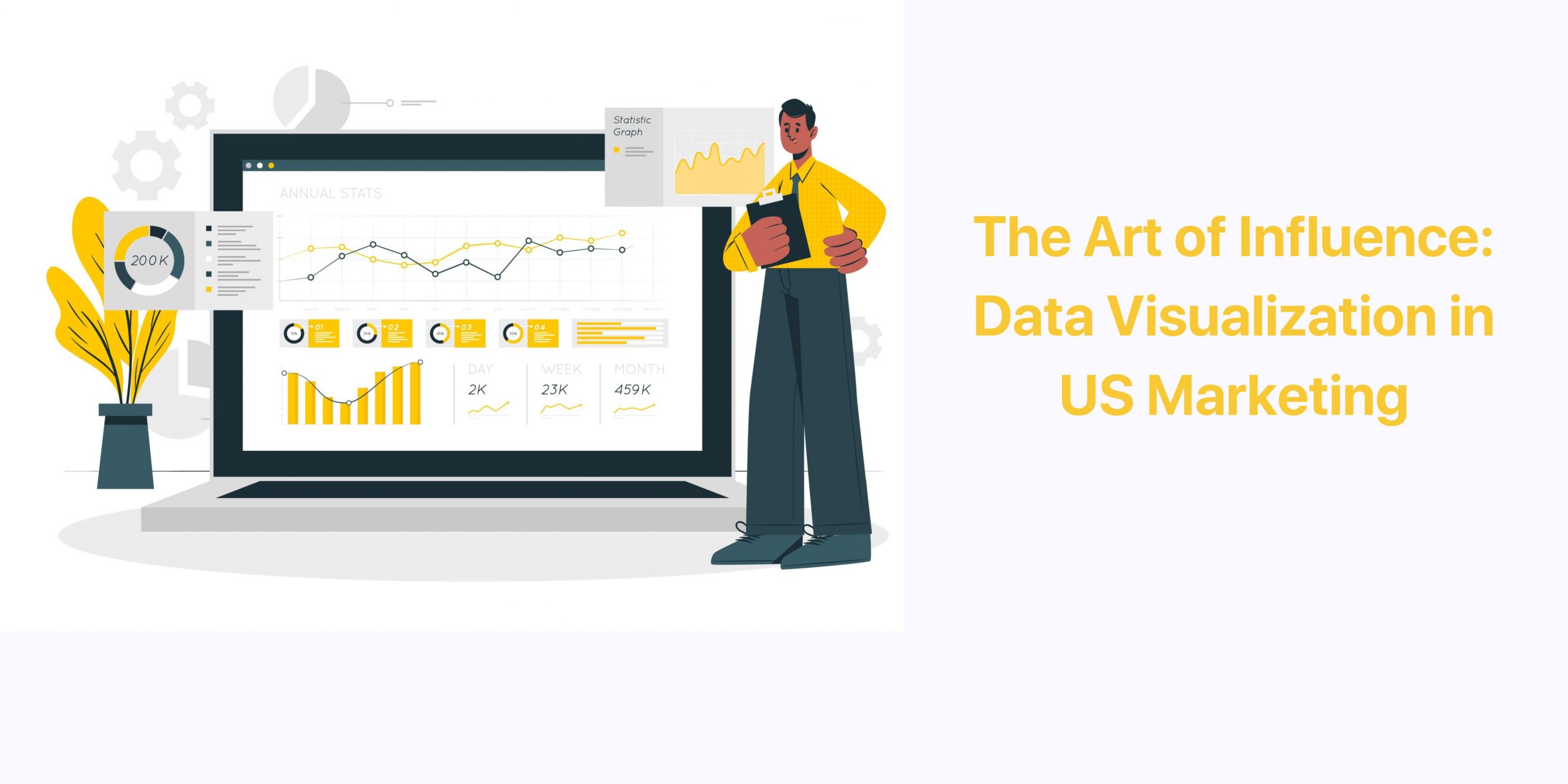
In the fast-paced world of marketing, one crucial aspect has remained constant: the power of data. With the advent of the digital age, the amount of data available to marketers has skyrocketed, offering valuable insights into consumer behavior, preferences, and trends. This wealth of information has given rise to the importance of data visualization in creating more effective marketing campaigns. By harnessing the potential of data visualization, marketers can gain a competitive edge in the ever-evolving landscape of advertising and promotion. In this blog, we will explore how data visualization can transform the way you approach marketing in the United States, helping you connect with your audience in more meaningful and impactful ways. Let’s dive into the world of data-driven marketing and discover how it can revolutionize your campaigns, ultimately leading to better results and higher ROI.
The Power of Data Visuals in US Marketing
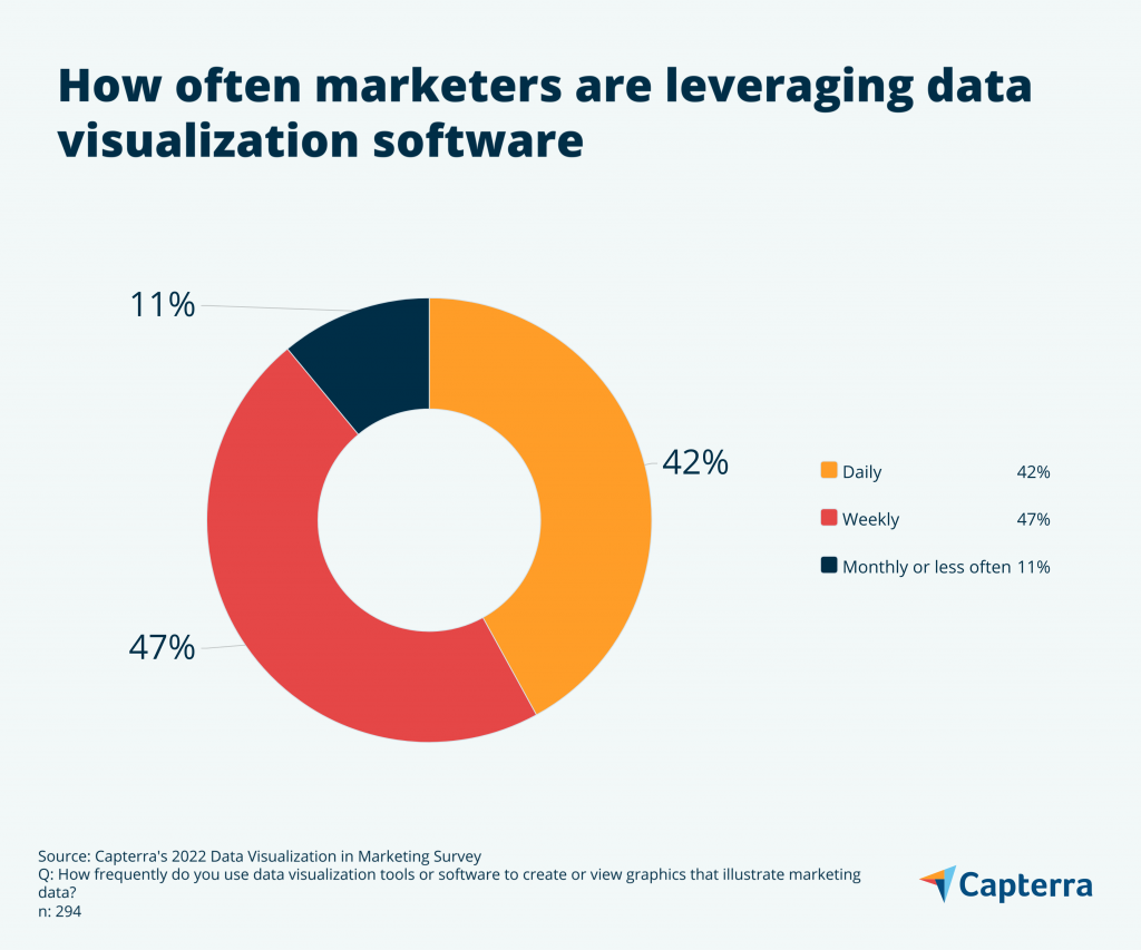
Source: Capterra
- 72% of organizations report that they can access insights faster, sometimes even in real-time, with modern data visualization tools.
- 57% of companies believe their success in the competitive market is tied to using effective data visualization techniques to understand and act upon business growth insights.
- Companies leveraging data visualization tools witnessed a 28% improvement in decision-making speed.
Visualizing Data: Top Tools for US Users
Popular data visualization tools:
Google Charts
Google Charts is a free and easy-to-use data visualization tool that offers a variety of different chart types, including bar charts, line charts, pie charts, scatter plots, and heatmaps. It is a good option for marketers who are new to data visualization or who need to create simple charts for their campaigns.
Google Charts is based on JavaScript, so it can be used to create data visualizations for both web and mobile applications. Google Charts also offers a variety of features for customizing data visualizations, such as adding titles, legends, and annotations.
Tableau
Tableau is a powerful data visualization tool that allows users to create interactive and visually appealing charts and dashboards. This is a good option for marketers who need to create more complex data visualizations or who need to share their data visualizations with others.
Tableau is based on a proprietary scripting language called VizQL (Visual Query Language). VizQL allows users to create data visualizations without having to write any code. Tableau also offers a variety of features for customizing data visualizations, such as adding filters, tooltips, and drill-downs.
Microsoft Power BI
Microsoft Power BI is a cloud-based data visualization tool that offers a variety of features, including interactive charts, dashboards, and reports. Power BI is a good option for marketers who need to create data visualizations for their teams or who need to integrate their data visualizations with other Microsoft products.
Power BI is based on the DAX (Data Analysis Expressions) programming language. DAX is a formula language that allows users to create calculated fields and measures. Power BI also offers a variety of features for customizing data visualizations, such as adding themes, branding, and security.
Infogram
Infogram is a data visualization tool that is designed for creating shareable infographics. This is a good option for marketers who need to create visually appealing and informative content for their social media campaigns or websites.
Infogram offers a variety of pre-built infographic templates that users can customize with their own data. Infogram also offers a variety of features for customizing infographics, such as adding text, images, and charts.
D3.js
D3.js is a JavaScript library for creating data visualizations. This is a good option for marketers who need to create custom data visualizations or who need to integrate their data visualizations with other web applications.
D3.js is a powerful library that allows users to create a wide variety of data visualizations, from simple charts to complex interactive dashboards. However, D3.js requires some knowledge of JavaScript to use.
Creating Visuals That Speak for Your Data
Choose the right chart type for your data.
Different chart types are better suited for different types of data. For example, if you want to compare two or more categories of data, you could use a bar chart, column chart, or pie chart. If you want to show a trend over time, you could use a line chart or area chart. If you want to show the relationship between two variables, you could use a scatter plot or bubble chart.Use color and other visual elements effectively.
Color can be used to highlight important data, create contrast, and make your data visualizations more visually appealing. Other visual elements, such as fonts, labels, and legends, can also be used to communicate your message more effectively. Here are some specific tips:
- Use a color palette that is consistent and complementary.
- Use brighter colors to highlight important data and darker colors to recede less important data.
- Use labels to clearly identify the different elements of your data visualization.
- Use a legend to explain the meaning of different colors, symbols, and patterns in your data visualization.
Make your data visualizations interactive.
Interactive data visualizations allow users to explore your data in more depth and discover insights that they might not have seen otherwise. There are a number of different ways to make your data visualizations interactive, such as:
- Allow users to filter the data by different criteria.
- Allow users to sort the data by different columns.
- Allow users to hover over different data points to see more detailed information.
- Allow users to zoom in and out of the data visualization.
Engaging Through Data-Driven Stories
Start with a clear message.
What is the objective of your data visualization? What do you want your audience to learn or do as a result of seeing it? Once you have a clear message in mind, you can start to think about the best way to communicate it using data visualization.Highlight key trends and insights.
What are the most important trends and insights in your data? Use data visualization to highlight these in a way that is easy to understand and remember. For example, you could use a line chart to show a trend over time, or a bar chart to compare different categories.Create a narrative.
Think about how you can use data visualization to tell a story about your data. This could involve using storytelling techniques such as conflict, resolution, and character development. For example, you could start by introducing a problem or challenge, and then use data visualization to show how your data can be used to address it.Use visuals effectively.
Use visuals such as color, fonts, and images to make your data visualization more engaging and visually appealing. However, be careful not to overuse visuals, as this can make your data visualization cluttered and difficult to read.Be clear and concise.
Avoid cluttering your data visualization with too much information. Focus on communicating your message in a clear and concise way. Use labels and legends to explain the different elements of your data visualization, and avoid using jargon or technical terms.
Here is an example of how to use data visualization to tell a story:
Imagine you are a data scientist working at a social media company. You have data on the number of likes and shares received by different types of posts and want to use this data to create a data visualization that will help you to understand how different types of posts perform on social media.
You could start by creating a bar chart that shows the average number of likes and shares received by each type of post. This would help you to identify the most popular types of posts.
Next, you could create a line chart that shows the average number of likes and shares received by each type of post over time. This would help you to identify any trends in performance.
Finally, you could create a scatter plot that shows the relationship between the number of likes and shares received by each type of post. This would help you to identify any correlations between the two metrics.
By combining these different data visualizations, you can create a story about how different types of posts perform on social media. For example, you might discover that certain types of posts, such as images and videos, consistently perform better than others. Or, you might discover that the performance of certain types of posts is declining over time.
By using data visualization to tell a story, you can make your data more engaging and informative for your audience. This can help you to communicate your findings more effectively and to make better decisions about your social media strategy.
The Art of Measuring Data Visualization Success
It’s important to measure the success of your data visualization campaigns so that you can see what’s working and what’s not. This information can then be used to improve your data visualization campaigns over time.
Here are some of the key metrics you should track:
Reach
Reach can be measured using a variety of metrics, depending on the platform where your data visualization is hosted. For example, if your data visualization is hosted on a website, you can use Google Analytics to track metrics such as page views, unique visitors, and time on page. If your data visualization is hosted on social media, you can use social media analytics platforms to track metrics such as impressions, engagements, and shares.
Engagement
Engagement can be measured using metrics such as the number of times your data visualization is shared, liked, commented on, or downloaded. You can also track metrics such as the amount of time users spend interacting with your data visualization and the number of different pages they view.
Comprehension
Comprehension can be measured using surveys or interviews with your audience. You can ask questions about how well they understood your data visualization and what they learned from it. You can also ask them to identify any areas where the data visualization could be improved.
Impact
Impact can be measured by tracking metrics such as sales, website traffic, and brand awareness. You can also track metrics such as the number of leads generated or the number of new customers acquired.
You can use a variety of tools and analytics platforms to track these metrics. For example, you can use Google Analytics to track the reach and engagement of your data visualizations that are hosted on your website. You can also use social media analytics platforms to track the reach and engagement of your data visualizations on social media.
Once you have tracked these metrics, you can use them to improve your data visualization campaigns over time. For example, if you find that your data visualizations are not reaching enough people, you could try promoting them more actively on social media or through other channels. If you find that people are not engaging with your data visualizations, you could try making them more interactive or visually appealing. And if you find that people are not understanding your data visualizations, you could try simplifying them or providing more context.
By tracking and analyzing the performance of your data visualization campaigns, you can ensure that they are effective at achieving your desired goals.
Summary Highlights
Data visualization is a powerful tool that can be used to communicate complex information in a clear and concise way. By following the tips in this blog post, you can create data visualizations that are engaging, informative, and effective.
If you need help creating or optimizing your data visualization campaigns, GeekyAnts can help. We are a team of experienced data scientists and engineers who can help you to create data visualizations that are tailored to your specific needs and goals.
Contact us today to learn more about our data visualization services. We would be happy to help you to create data visualizations that will help you to achieve your business goals.